Problem: There are 73 chart types. When should I use which chart type?
Strategy: Here are several examples:
- For time series with equal points, you can either use column or line. People expect time to move from left to right. Use column for 12 points or less, lines for 12 points or more.
- For time series with unequal points or with hours, use scatter.
- Don't use pie charts over time. Instead, use a stacked 100% column chart.
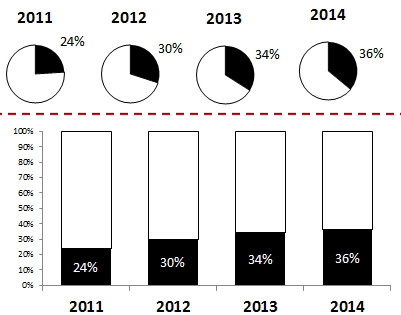
- Replace four pie charts with one stacked 100% column.
- For comparing sales of products that have long names, a bar chart allows plenty of room for the long text labels along the left axis.
- Never use a pie chart for item comparison. Pie charts should only be used to show how several items add up to 100%.
Excel offers some other chart types that have not been covered.
If you have survey data for your company and a competitor, you can plot both results on a single radar chart. This shows the relative ranking for each of the questions.
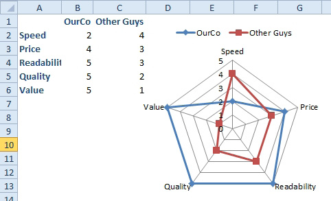
- We are slow, but are winning everywhere else.
A bubble chart is like a scatter chart, but the size of the point conveys a third bit of data. For example, you might compare miles along the x-axis, age along the y-axis, and price of the car as the size of the bubble.
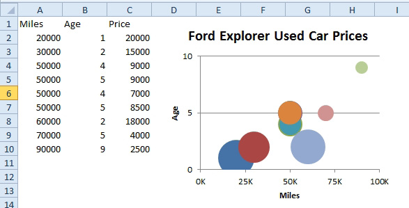
- The size of the bubble indicates price.
Excel offers four types of stock charts. The name of the chart tells you the order in which the data columns should be arranged.
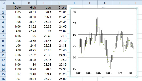
- A high-low-close chart in Excel.
Excel also offers surface charts and donut charts.
There are many other types of chart that you might need to create. For these charts, third parties offer utilities. Mala Singh of XLSoft Consulting offers utilities to draw speedometer charts and macroeconomic supply curve charts.
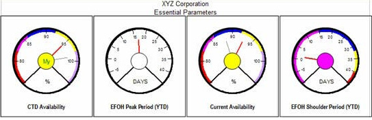
- Visit http://www.mrexcel.com/speedometer.html
Jon Peltier offers utilities to create a variety of charts:
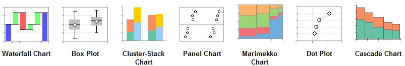
- Visit http://tinyurl.com/jonpeltier