Problem: How to I create a scatter chart with two series?
Strategy: Create a chart with one series. Then select the second series and use Paste Special to get that data on the chart. Most of the charts that you use in Excel have labels for the category axis in column 1, data for the first series in column 2, data for the third series in category 3, and so on. Microsoft has shoe-horned the scatter chart into the same engine used to create regular charts and it makes it a bit difficult to specify the second series.
In a scatter chart, the first column is used to specify a numeric location along the x-axis. The second column is used to specify a numeric location along the y-axis. Scatter charts are also known as X-Y charts for this reason.
Scientists use scatter charts to compare two variables. If you have some variable that you can control, put that along the x-axis. Plot another variable which is dependent on the first variable along the x-axis. The resulting pattern of the dots plotted in the chart allow you to spot patterns and outliers.
Excel tricksters use scatter charts because they solve a number of problem. The only way to show hours and minutes along the x-axis is to use a scatter chart. Scatter charts are also really good ways of drawing a line at a specific place on a chart.
I like to use scatter charts to compare two different populations of data. This particular chart is maddening to create in one step. For whatever reason, the scatter chart almost always comes out when I am used car shopping. We will start with that scenario.
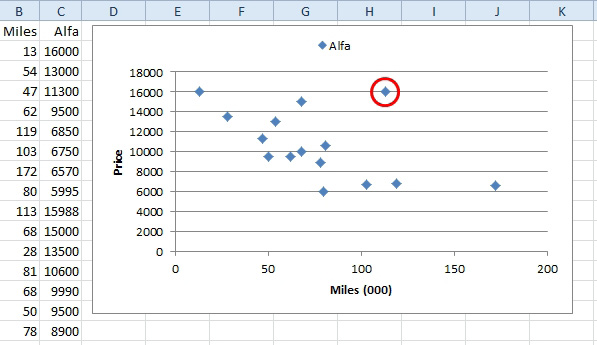
I just went through one of the online car shopping sites and found all of the Alfa Romeo Spider Veloce vehicles for sale in the United States. I made a list of them, comparing mileage and asking price. I wanted to see how mileage and asking price are correlated. Mileage goes in column 1. Asking price in column 2. For reasons that will become evident later, the heading for column 2 should be Alfa.
- Select the two columns including the headings.
- Insert, Scatter, Scatter With Only Markers
- Layout, Chart Title, None
- Layout, Axis Titles, Primary Horizontal Axis Title, Title Below Axis.
- Click on the Axis Title and type Miles (000). Press Enter.
- Layout, Axis Titles, Primary Vertical Axis Title, Title Below Axis.
- Click on the Axis Title and type Price. Press Enter.
- Layout, Legend, Show Legend at Top.
You now have the chart shown below. You would expect the dots to slope from top left to lower right. As the miles increase, the price should go down. The dots roughly fall in this pattern, but there are outliers.
The highest priced car is the one with only 13,000 miles. That is impressive for a car that is 20-30 years old at this point. But, there is also a car for the same price with 113,000 miles. That point is in an outlier. The other cars with that many miles are half the price. Either this car is pristine and restored, or the owner has no sense of reality.
- The scatter chart shows the relationship of price and miles.
I learned about using scatter charts from Rich Lanza of AuditSoftware.net. Rich will throw 5000 vendors in a chart and spot the 10 that need to be audited in an instant.
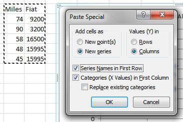
For the chart above, I wanted to compare the Alfa Romeos to the Fiat Spider. Both cars have similar styling with both bodies designed by Carozzeria Pininfarina. I built a second pair of columns for all the Fiats for sale. Miles in column 1, price in column 2. The heading for column 2 is Fiat.
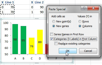
To add a second series to the existing chart, follow these steps:
- Select the new two-column range of data, including the headings.
- Ctrl+C to copy.
- Click once on the chart.
- On the Home tab, open the Paste dropdown and choose Paste Special. Alternatively, type Alt+E+S. Excel displays the chart version of Paste Special.
- In the Add Cells As, change from New Points to New Series.
- Values (Y) are in columns.
- Since you included the headings in step 1, choose Series Names in First Row.
- Choose Category (X Values) in First Column.
- Leave Replace Existing Categories unchecked.
- Click OK.
- Add a second series using the Paste Special dialog.
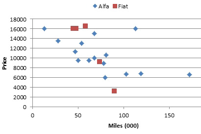
The result is a scatter chart comparing the Alfa and Fiat options. The Fiat offers the most expensive choice as well as the least expensive choice.
- Compare Alfas and Fiats.
The Paste Special dialog requires several clicks, but it makes adding the additional series much easier.
Additional Details: It is common with scatter chart series to have a different number of points in each series. This would be unusual in a line or column or bar chart.
If you are only plotting markers and not lines between the markers, the data does not need to be sorted.
Scatter charts are a better choice when you have time data where the points are not at fixed intervals. Say that you start with $100 on December 31 and add one dollar every day. You only bother to count the money every few months. This line should be perfectly linear, because you never fail to add the dollar bill.
The figure below compares two varieties of line chart and a scatter chart with a line. The first choice, with a text axis plots each point equidistant and is misrepresentative. The second choice uses a date axis. This should be correct, but that line is not a straight line. The third choice uses a scatter chart. It is the only one to show a perfectly straight line.
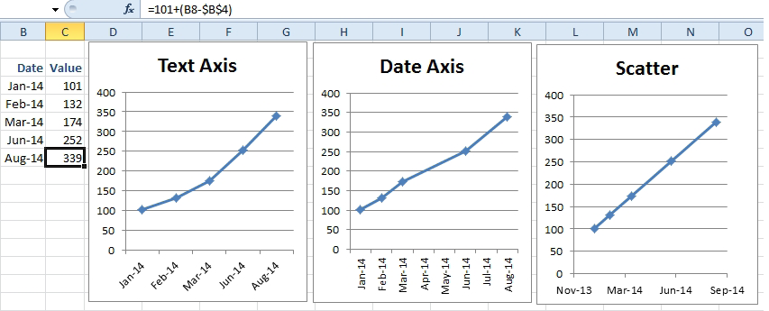
- The scatter is better for this date series.
When you are tracking data by time, the scatter is really the only choice. If you try to use a line chart, the Date Axis option will plot all of the times in a single column, back-dating the points to midnight of that day. The scatter chart is the only way to show the true progression over time.
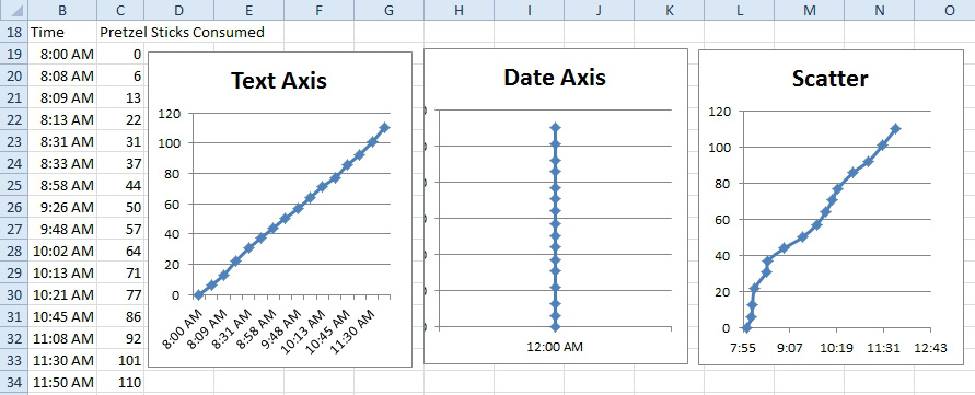
- For irregularly spaced time data, the scatter is a must.
Gotcha: Labeling scatter charts is annoyingly difficult using Excel. If you need to label individual points, search for Rob Bovey's Chart Labeler utility. It is free. It does exactly what you need.
Scatter charts are a great way to draw on a chart. Do you need a straight line? It only takes two points to draw a line. Way back in Fig 1104, I added two line chart series to draw a horizontal line at 70 and 90 in that chart. Those lines don't stretch all the way across the chart. They start in the middle of the first point and extend to the end of the last point. Had I added two scatter chart series instead, I could have achieved a true line all the way across the chart.
You need nerves of steel to do this, because during several steps, your chart will head in the wrong direction. You need to keep going until the end when everything will look OK. Follow these steps to add lines at 70 and 90 to a chart.
- For the first line, you need two data points. Plan on having the x-axis stretch from 0 to 1. (Think about this like 0 to 100% of the width of the chart). Enter a range that shows the height at 0 is 70 and the height at 100 is 70. This will be a straight line all the way across the chart at a height of 70. This is entered as a two-row by two-column range.
- Enter the range for the second line. Enter 0, 90; 1, 90 in four cells.
- Select the first range of four cells. Ctrl+C to copy.
- Select the chart. Paste Special. Choose New Series. Columns. Categories in First Column. Leave the other two checkboxes unchecked.
-
Paste the first line to the chart.
Already, things are starting to look bad. The new series is added as a stacked series on top of A & B.
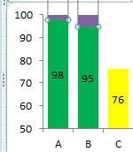
- This doesn't look like a line.
- Choose the new series. On the Design tab, choose Change Chart Type. Select a Scatter chart with a line. Your new series now appears as a line, but it isn't a very good line. It doesn't go across the chart. It doesn't appear anywhere near the 70 on the left axis.
The problem is that the new series is using a secondary vertical axis that goes from 0 to 80 and a new secondary horizontal axis that goes from 0 to 1.5. You need to edit both of those axes to change the minimum and maximum value.
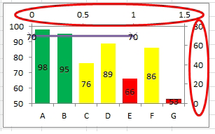
- The new series uses two new axes.
- Select the secondary vertical axis. Click Format Selection. Change the Minimum to Fixed and 50 to match the left vertical axis. Change the Maximum to Fixed and 100. Don't close the Format dialog box yet.
- Click the axis at the top of the chart. In the Format dialog, choose a minimum of Fixed 0 and a Maximum of Fixed 1. (Refer back to step 1 where the plan was to have the x-axis stretch from 0 to 1.) The line now stretches all the way across the chart.
- Select the four-cell range for the second line. Copy those cells. Click the chart. Paste Special. Use the same settings as in Fig 1113.
You now have a chart with the lines going all the way across the chart at the correct location.
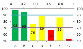
- The lines stretch across, but the extra axis labels will confuse.
To get rid of the extra axes and clean up the lines, follow these steps:
- Click the numbers on the right axis. Type Delete.
- Click the numbers on the top axis. Type Delete.
- Choose the line at 70. Choose Layout, Data Labels, None. On the Format tab, use the Shape Outline dropdown to change the color to red, the weight to 1/4 point and the dashes to the dashed line. In the Format dialog, choose Marker Style, None.
- Repeat step 11 for the line at 90.
The result is a chart with the lines going all the way across.
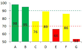
- Success!
The scatter series can be used to draw an arrow that always points to the height of one column. For an arrow to point to the column for E, I figured that a good starting point would be 2/7 of the way across the chart. The ending point would be 4.5/7 of the way across the chart. For the starting height, I chose 95. For the ending height, I used a formula to add 1 to the data point for E. Add the scatter series as described above. To draw the point on the arrow, select the line and use Format, Shape Outline, Arrow and choose the line that ends with an arrow.
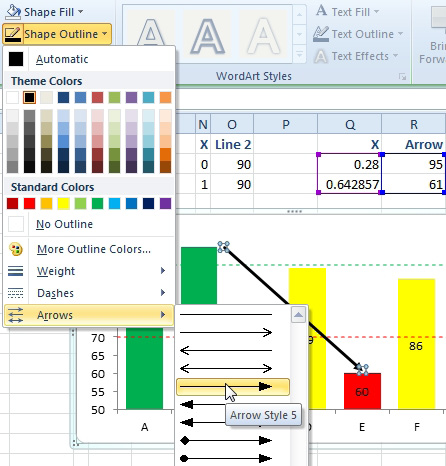
- You can add an arrow head to a series line.
The result: when the value for column E changes, the arrow keeps pointing to the top of the column.
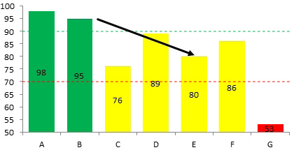
- The arrow automatically moves with the data point.