Problem: I have monthly historical sales data. I want to predict future sales by month.
Strategy: You can use the least-squares method to fit the sales data to a trendline. Excel offers a function called LINEST that will calculate the formula for the trendline.

- Forecast future data.
You might remember from math class that a trendline is represented by this formula: y = mx + b
In this example, y is the revenue for the month, m is the slope of the line, x is the month number, and b is the y-intercept. If you were to look at the data, you might guess that the prediction for a given month is $10,000 + Month number x $400. In this case, the value for b would be 10,000, and the value for m would be 400. This is just my wild guess; Excel can calculate the number exactly.
LINEST is a very special function. Instead of returning one number, it actually returns two (or more) numbers as the result. If you select a single cell and enter =LINEST(C2:C35), it will return a single number, which is of no help. Entering the formula the wrong way returns a single answer of 204.8133. The first time you do this, you might wonder how the number 204.81 could describe a line.
It turns out that Excel really wants to return two numbers from the function. Here's the trick:
- Select two cells that are side by side.
- Type the function in the first cell. After you type the closing parenthesis, press Ctrl+Shift+Enter. Excel returns both the slope and the y-intercept.
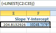
- The results appear in 2 cells.
- Add a Prediction column. In column D, enter a formula to calculate the predicted sales trendline. The formula is the intercept in F2 plus the slope in E2 times this row's month number.
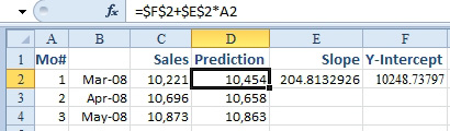
- Use the results of the ÂLINEST to predict sales.
You will now be able to graph columns B:D to show how well the prediction matches the historical actuals.
Additional Details: When the data along one axis of your data contains dates, it is best to delete the heading in the upper-left corner of your data set before creating the chart. You clear cell B1, select B1:D47, and select Insert, Line, Line with Markers. As shown below, the resulting chart shows that the predicted trendline comes fairly close to the actuals. You can also see that the formula predicts that you will be selling almost $20,000 per month one year from now.
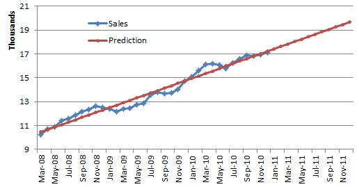
- Plot actuals vs. forecast to see if the sales match a trend.
Gotcha: When you select two cells for the LINEST function, they must be side by side. If you try to select two cells that are one above the other, you will just get two copies of the slope.
Alternate Strategy: A different method is to use the INDEX function to pluck a specific answer from the array.
=INDEX(LINEST(C2:C35),1,1) will return the first element from the array. This is the slope.
=INDEX(LINEST(C2:C35),1,2) will return the second element from the array. This is the y-intercept.
See Also: "Add a Trendline to a Chart" on page 471.