Problem: In his book Success Made Easy, retail guru Ron Martin suggests using a daily chart to track your progress toward a goal. His typical chart shows your progress toward the goal as well as where you need to be to remain on track.
Here, the thin line is the track. This is where I would need to be in order to finish by the set goal. The thick, wavy line is my actual work toward the goal. I can see from the chart that I am currently slightly ahead of the track. However, what would happen if I continued to work at my current average pace? Would I meet the goal?
Excel makes it easy to add a trendline to charted data.
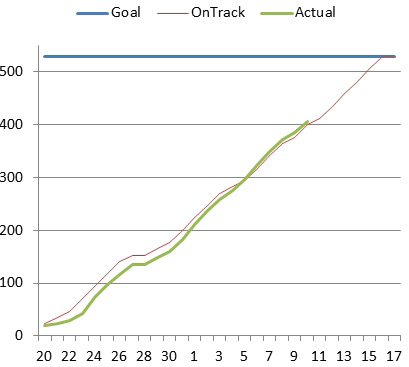
- Actuals are barely ahead of the On Track line.
- Right-click the graphed line for actual results. From the menu that appears, choose Add Trendline.
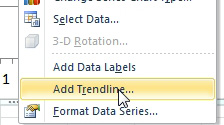
- Add a trendline to the Actuals line.
- Excel displays the Format Trendline dialog. There are a few settings to change in this dialog. Go to the Trendline Name section. Change the name to Custom. Type a name such as Forecast. Keep the dialog open.
- Choose Line Style from the left navigation. Open the Dash Type dropdown and choose a dashed or dotted style. Since this line is only a forecast, you want to differentiate it from the other lines.
The result is a dotted line that shows the predicted results if you continue at your current pace.
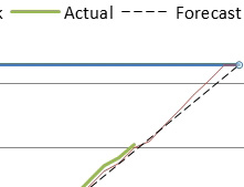
- Excel projects your final results based on past actuals.
As you continue to plug in actual data, the trendline will redraw. Seeing the forecast line predict a sizable miss usually causes me to really put it into hyperdrive for the next few days. A couple of days of above-average activity causes the actual line to go above the track line. Nevertheless, the dotted trendline is still predicting that I will miss the goal. That is because the trendline sees all those days early in the month when I did practically nothing. It predicts that those days might happen again.
In other data sets, the chart might only show actuals, with the last actual appearing at the right edge of the chart. In that case, you can use the Format Trendline dialog to specify that the trendline should predict forward a certain number of periods.