Problem: I want to shade the areas between the gridlines in this chart.
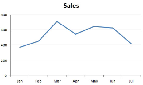
- Add alternating shading between the gridlines.
Strategy: Use four series as stacked area charts.
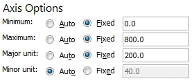
To use this method, you need to take control of the vertical axis. Format the vertical axis. Figure out the minimum, maximum, and major unit that you will be using.
-
Make sure the scale won't change.
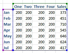
- Go back to the original data. Insert a new series for each gridline. These series will be stacked. The first series of 200 will run from 0 to 200. The second series of 200 will be on top of series 1 and will run from 200 to 400. Have your Sales series be the last series.
- One rogue series for each band of alternate shading.
- Choose Insert, Area, Stacked Area chart. Don't worry that the initial chart looks completely wrong.
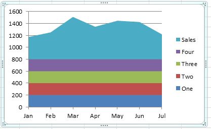
- It is typical for these trick charts to look wrong at first.
- Select the Sales series. Use Design, Change Chart Type. Change it to a Line chart.
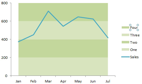
- Format the vertical axis. Go back to the settings in Fig 1096.
- Click on one of the gridlines to select all the gridlines. Press Delete.
- Select series One. Use Format, Shape Fill and choose a light color.
- Repeat step 6 for the remaining area series, choosing alternating dark and light colors.
At this point, the effect is complete, but the legend is giving away your secret. You can delete individual entries in the legend.
- You need to delete 80% of the legend.
- Click once on the legend to select it.
- Click a second time on Four. This selects the one legend entry.
- Press Delete. That one entry in the legend is deleted.
- Repeat steps 8-10 for series Three, Two, and One.
There are a number of special charts where extra rogue series are used to create some formatting. For more examples, check out:
- Mario Garcia's amazing five rogue charts in order from Learn Excel Podcast episode 1026.
- Andy Pope's charting tutorials at http://www.andypope.info/.
- Jon Peltier's charting tutorials at http://peltiertech.com/Excel/Charts/.