
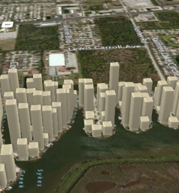
Power Map is a new feature in Excel 2013. If your data includes fields such as Street Address, City, State, Zip, Country, Continent, Latitude or Longitude, you can plot your pivot table on a map. You can then use the mouse to fly through the map, zooming in on various pockets of your data.
- Analysis of home sales in a neighborhood.
To get started, select any data set that has a geographic component. On the Excel 2013 ribbon, choose Power Map.
Excel will use Bing to geocode each data point into a location on the map. If your data has obvious headings like City, State, Power Map will figure those out. But if your field names do not make sense, you need to choose a geography level for each field.
Gotcha: if you have a field such as "123 Main Street", be sure to classify this as a Street and not an Address. Only use Address if your field is like "1060 W Addison St, Chicago, IL 60613".
To build the map, choose from Stacked Column, Clustered Column, Bubble, Heat Map, or Region. Note that region only works for State or Country data.
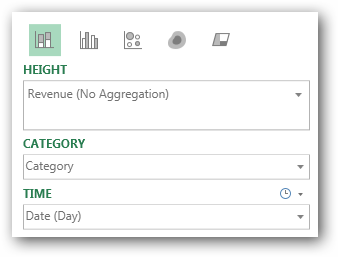
Add a numeric field for Height. To control colors, add a text field for Category. To animate the map over time, drag a date field to the Time area.
The dropdown for Height offers to let you Sum, Average, or No Aggregation.
There are two dropdowns for Time. If you have daily data, change the Time dropdown to Day. Just above the Time field, a smaller dropdown allows you to choose if data appears for an instant, accumulates over time, or stays until another value replaces the first..
- Control the map here.