Problem: The new Excel has a lot of nice-looking features. It uses new colors, new fonts, new chart colors. But after a while, the blue, red, green, purple, teal, and orange colors get old. Here is a worksheet with a table, SmartArt, a chart, a picture, and shapes.
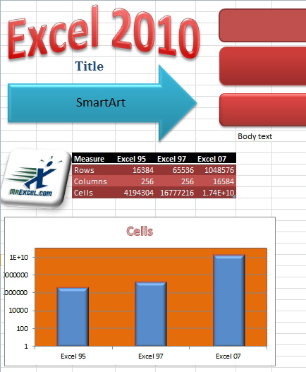
- The colors can start to look old.
Strategy: Excel 2010 offers 40 built-in themes and adds a dozen more from Office Online.
When you choose a new theme from the Page Layout ribbon tab, Excel changes the accent colors, fonts, and effects in the workbook.
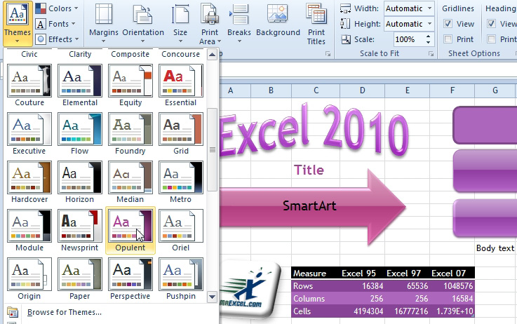
- Choose a new theme for new colors, fonts, and effects.
Excel, Word, and PowerPoint offer the same themes. If you choose the same theme in all three products, your documents should have a similar look and feel.
Additional Details: A theme comprises six accent colors, title and body fonts, and a series of effects.
The Effects dropdown is confusing. For each theme, Excel shows the effects for a circle, an arrow, and a rectangle. The circle gives an indication of the format used for simple formats. The arrow shows the effects used for moderate formatting. The rectangle shows the effects used for intense formats.
From the thumbnails here, you can guess that Module will offer double lines in simple effects, the Paper theme will offer muted or flat moderate effects, and the Opulent theme is going to offer glass effects when you choose intense formatting.
When you open many galleries such as the Shape Styles Gallery, the last three rows will be labeled "Simple", "Moderate" and "Intense". These correspond to the circle, arrow, and rectangle icons in the Effects dropdown.
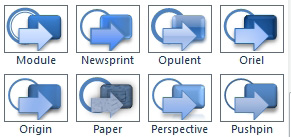
- 3 shapes indicate 3 levels of effects.