
Problem: I need to create 12 charts every month. It is a real pain to re-create these charts every month.
Strategy: You can easily add data to an existing chart.
The first method is to copy the data and paste it on the chart. Here's how:
- Type the new data for your chart adjacent to the old data. Be sure to add a heading.
- Select the new data, including the heading.
- Ctrl+C to copy the new data.

- Copy the new data.
- Click on the chart.
- Ctrl+V to paste. The new data is added to the existing chart.
- New data added.
The second method is to click the chart and find the blue outline around your data. You can drag one of the right handles to the right to add a new data point, drag the left handle to the right to remove a data point, or drag an edge to chart a different range.
- Drag the blue handle to add data
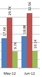
Additional Details: If you need to show a rolling six months, after adding July to the data, you can drag the blue handle from B5 to the right. You will remove January from the chart.
Additional Details: Dragging the blue outline can simplify the task of creating many charts as described in the previous topic. Create the first chart and copy it. When you select the first chart, one customer is outlined in blue.
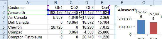
- Drag the blue box to a new row.
Drag the edge of the blue box to a new customer. The chart will update. Note that if you drag the blue box, the green box will move with the blue box.
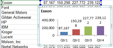
- Drop the blue box on Exxon and the chart redraws.